AT&T RESPONSIVE MOBILE
Company: AT&T (Kforce Consultant) Role: Sr. UX Design Consultant
About
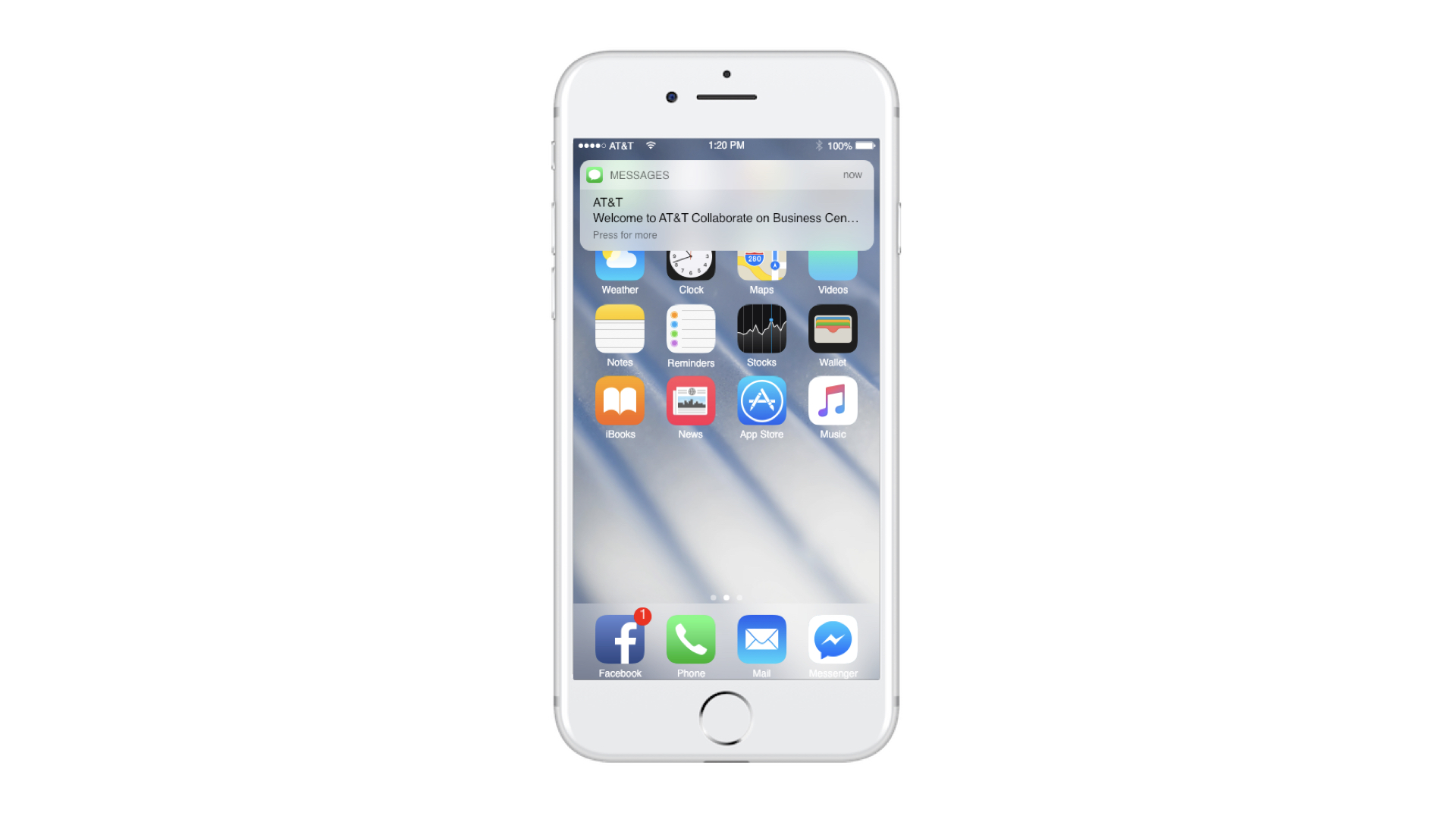
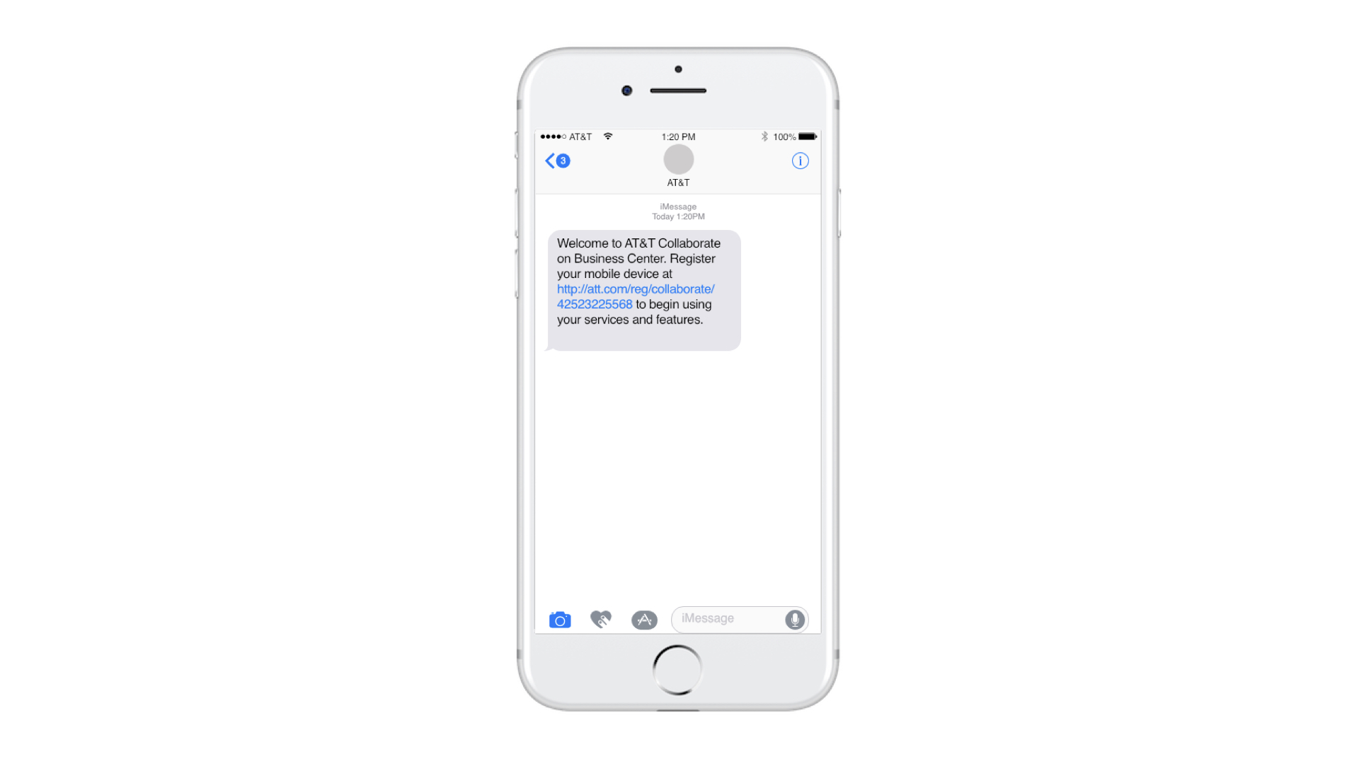
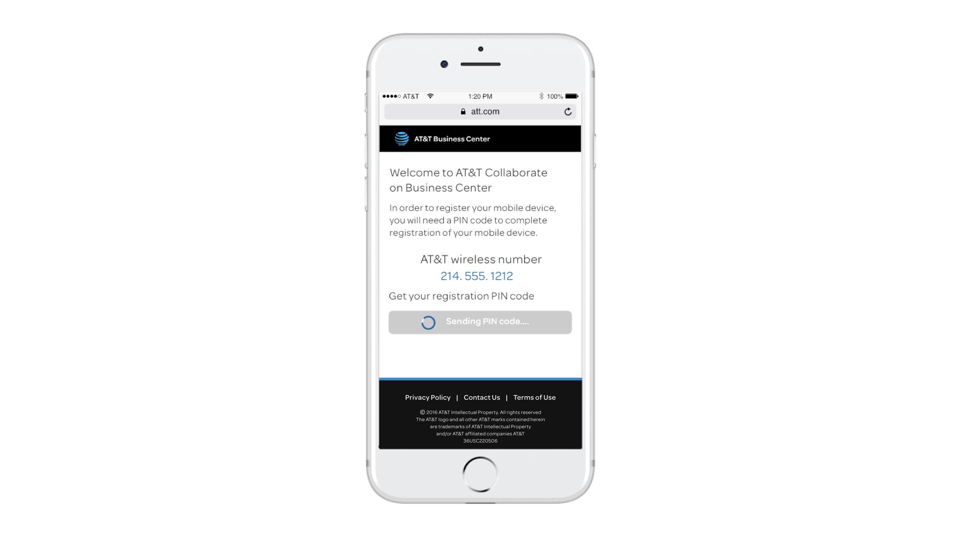
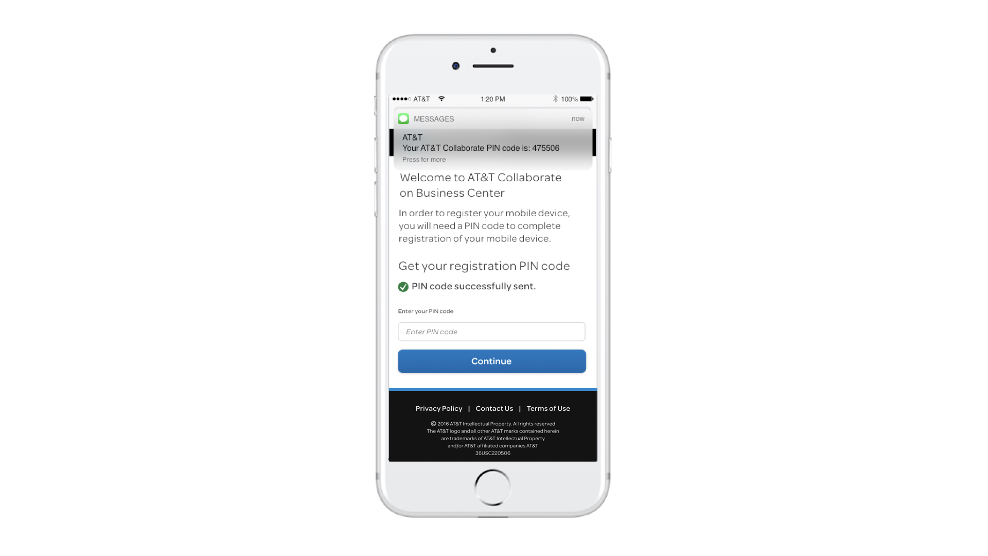
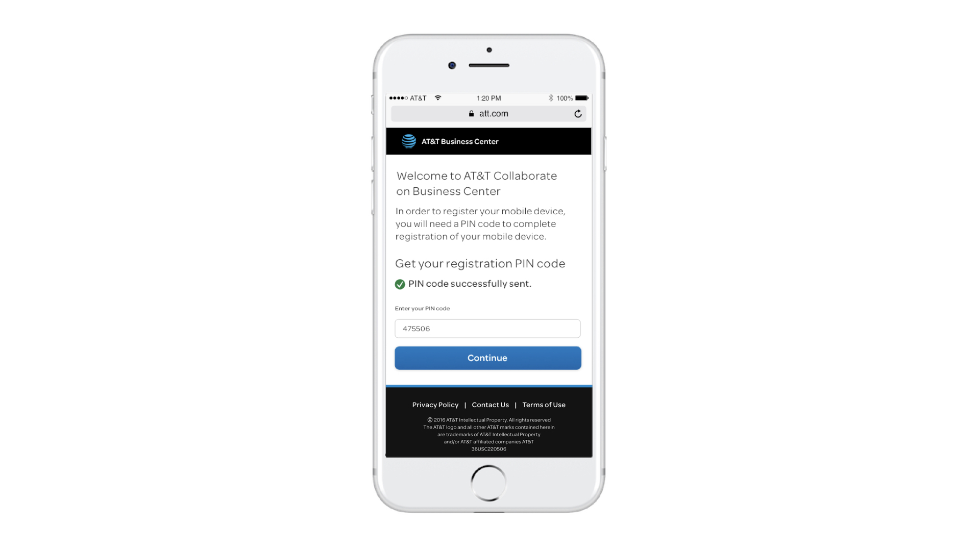
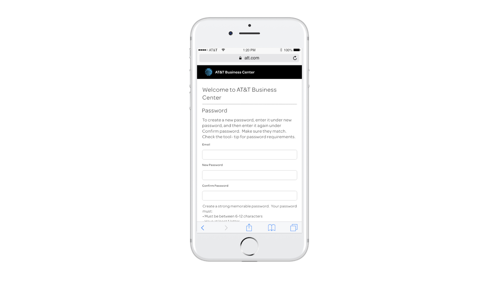
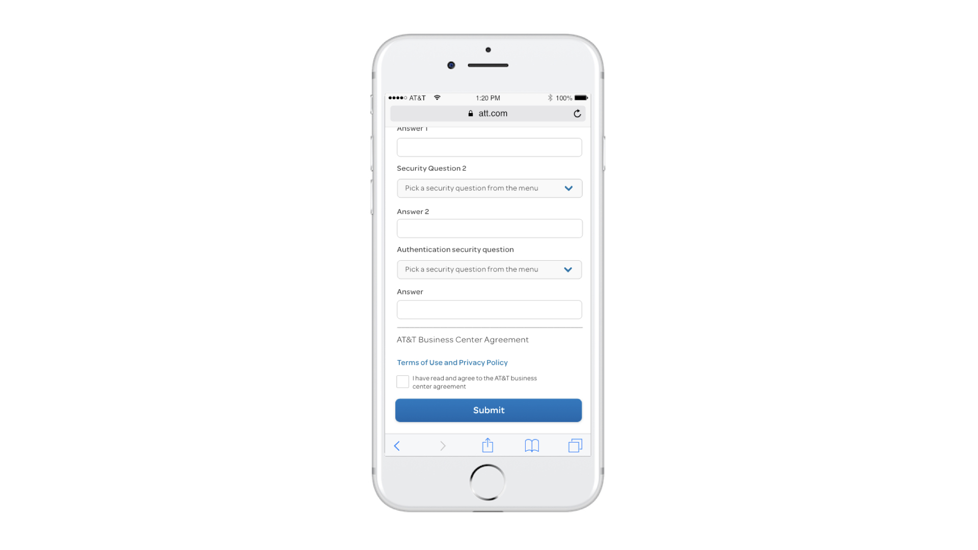
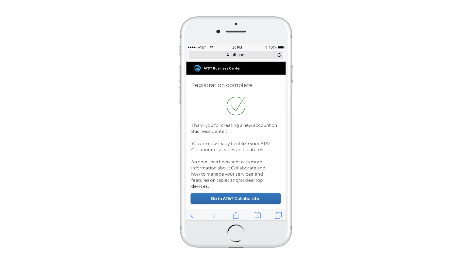
When system administrators add a new AT&T Collaborate user in Business Center (BC), an SMS is sent prompting the user to register via their mobile device.
THe problem
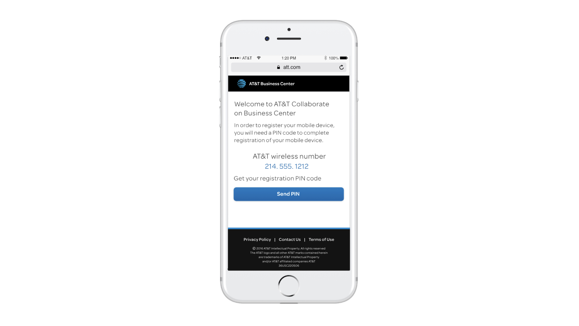
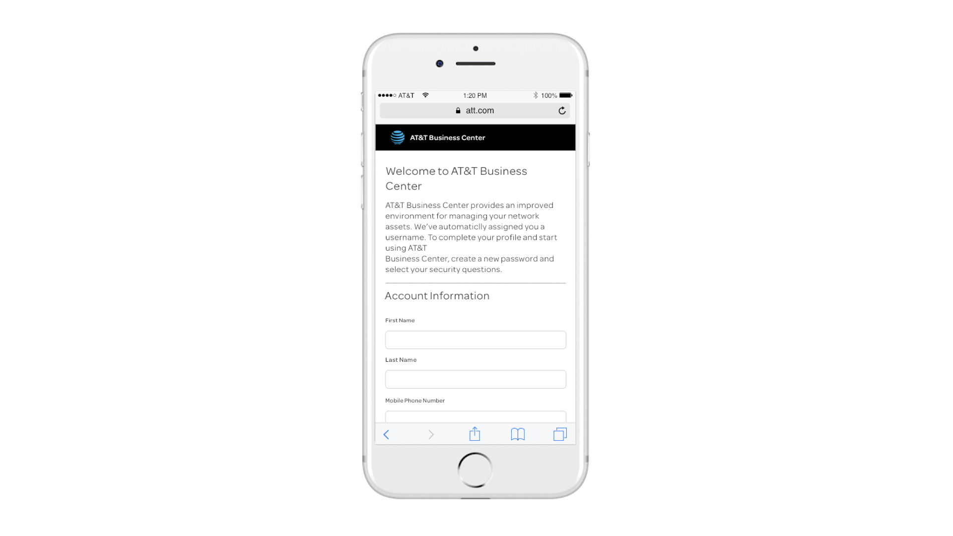
Business Center was originally built as a desktop-only platform, leaving mobile users with a broken and frustrating experience. As you can see in the mobile screen (pictured), first-time users struggled to navigate the platform on smaller screens.
The challenge was clear: how do you take a large, legacy system and make it work seamlessly on mobile?

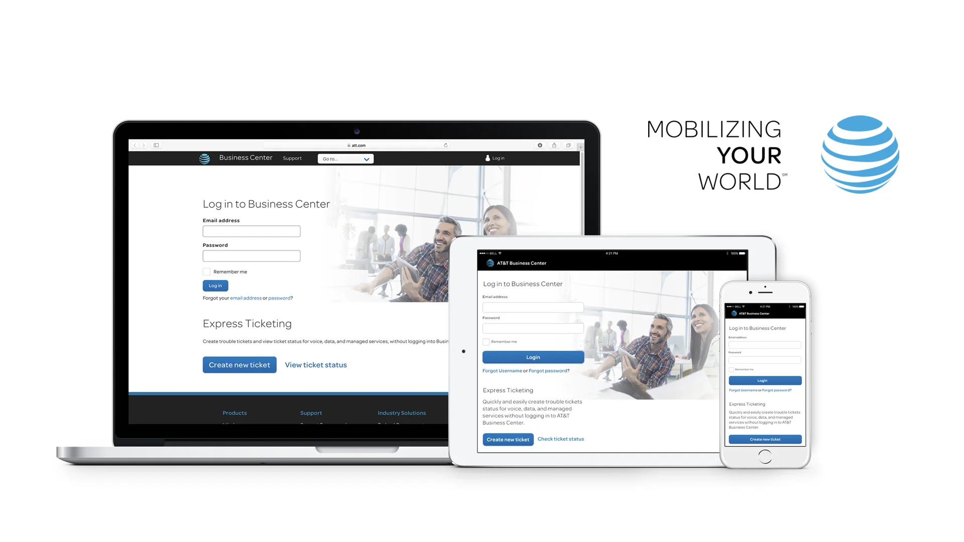
THe SOLUTION
I applied responsive design principles using Bootstrap grids, containers, and breakpoints. Translating an existing desktop system into a mobile-first experience is never straightforward—it requires rethinking layout, scaling, and interaction patterns.
I analyzed existing desktop containers, established consistent widths, and defined breakpoints that would adapt gracefully to tablet and mobile screens.
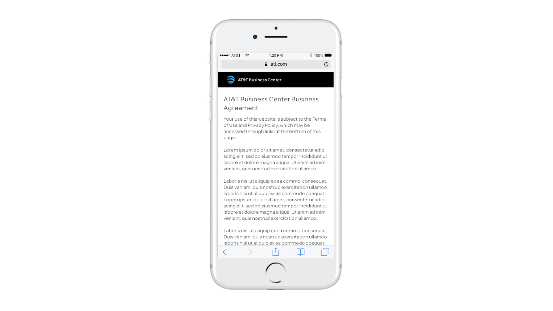
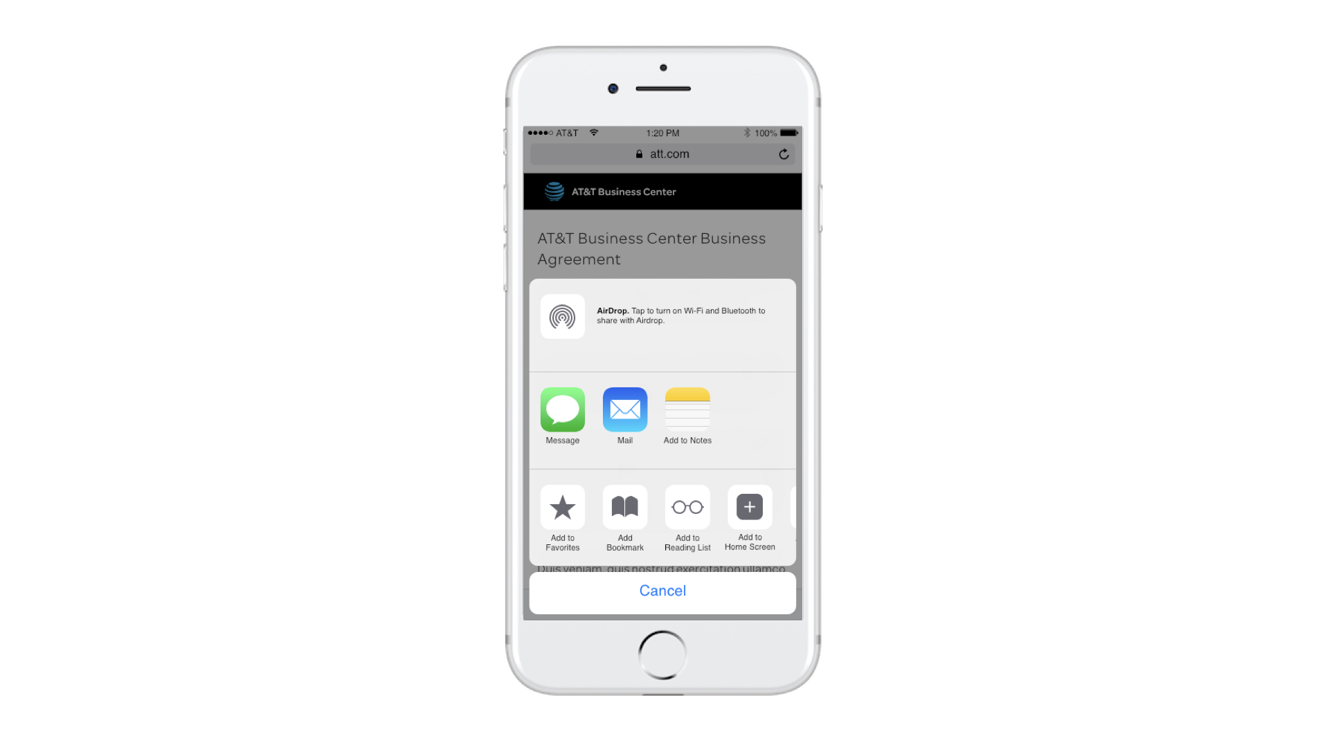
The result: a seamless, cross-platform experience that allows users to navigate BC confidently, whether on desktop, tablet, or mobile.
FINAL UX/UI
Click on the thumbnails or arrows to view every screen.

Want to go somewhere else?